
JOY phOTO ALBUM
July 2015
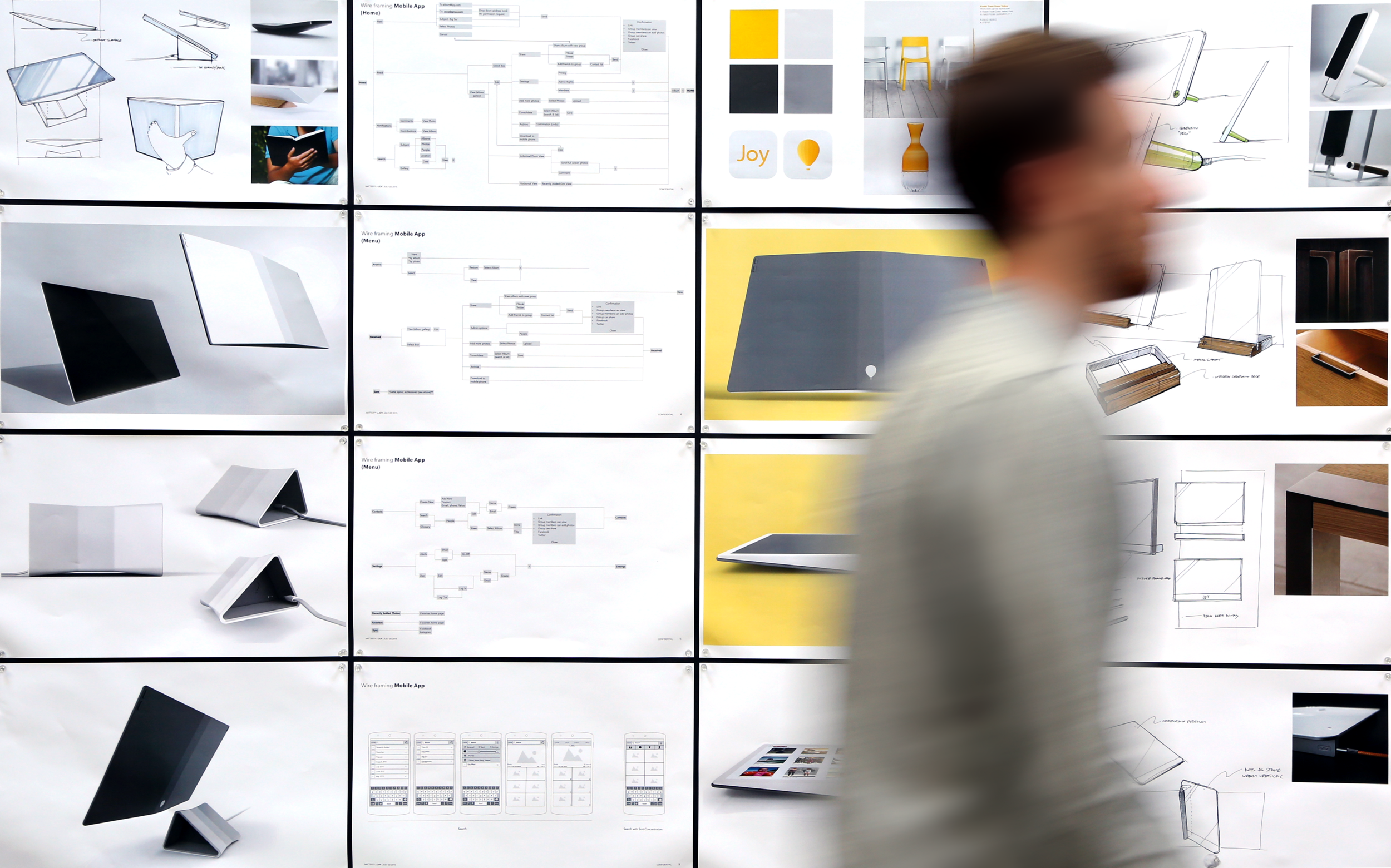
Founder of Joy, Alan Chan engaged with Matter to help realize his vision for an all-in-one solution to organize and relive your memories. Joy asked us to establish a design direction for the industrial design, UI/UX, and branding for the interactive photo album.
As design lead, I provided creative direction and executed the heavy lifting in creating the final industrial design, visual design / wire-framing for the app, along with branding and animation for the logo. This work along with design assistance for the supporting pitch materials resulted in Joy successfully receiving $2.5 million in seed funding, allowing for the team to take the album to production.
Team: Kevin Hoffman, Justin Porcano, Frankie Vazquez

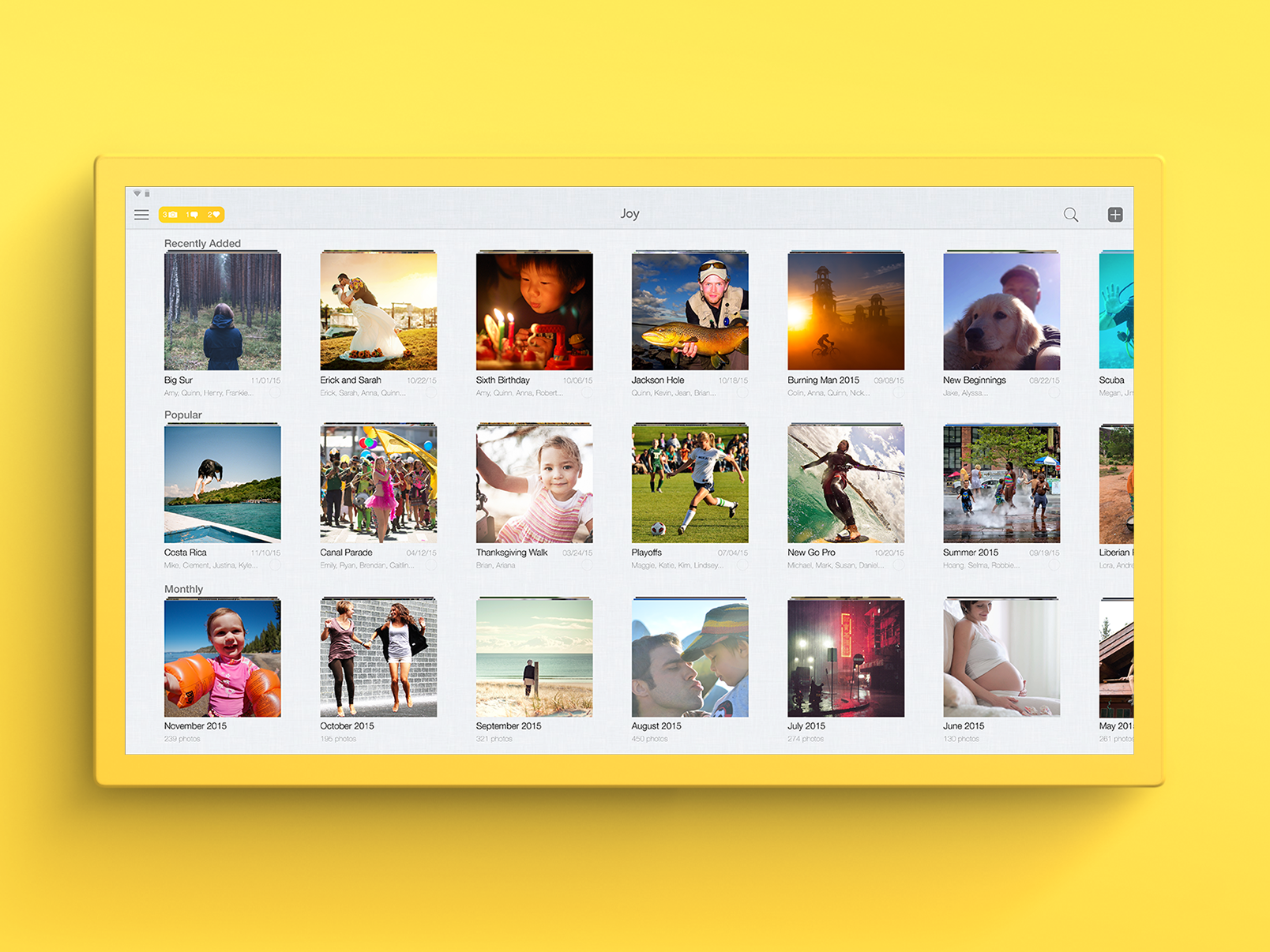
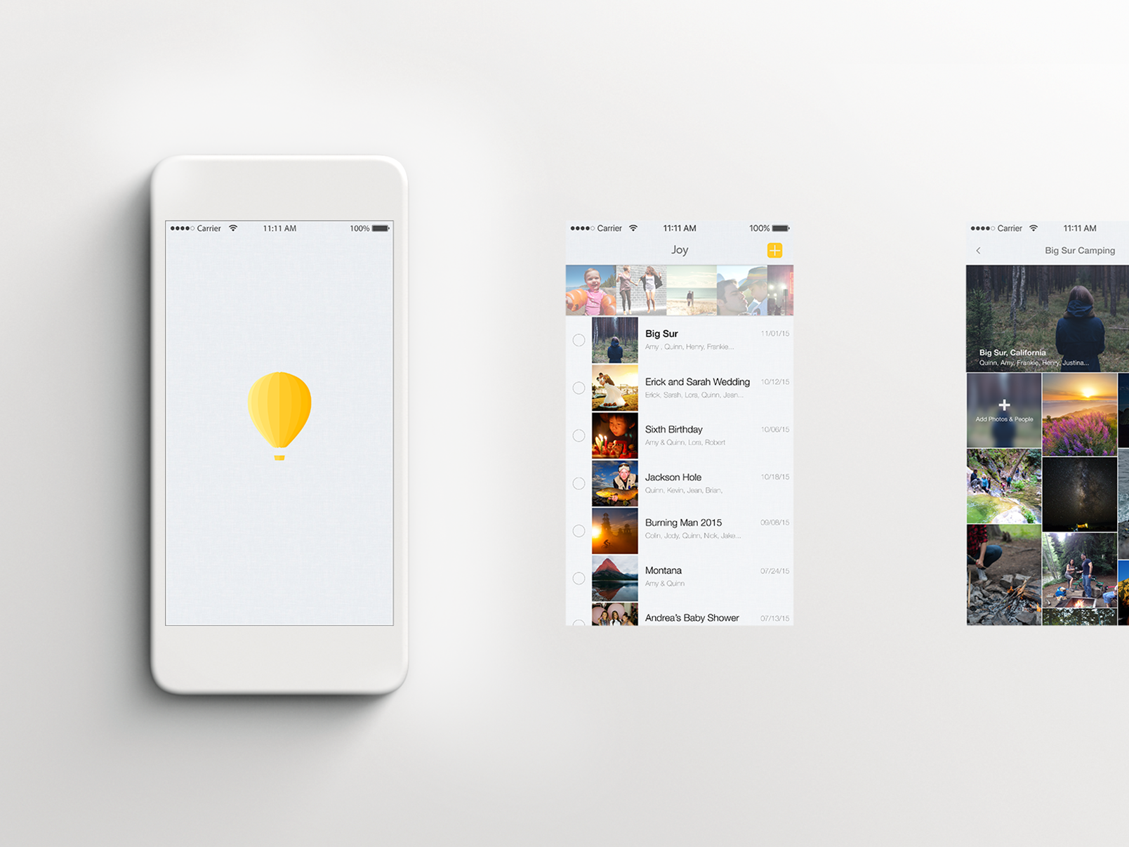
Joy is an interactive photo album that consolidates personal media seamlessly by importing photos/videos from your camera, or any social media site. The content is available to access, curate, and share privately with friends and family.

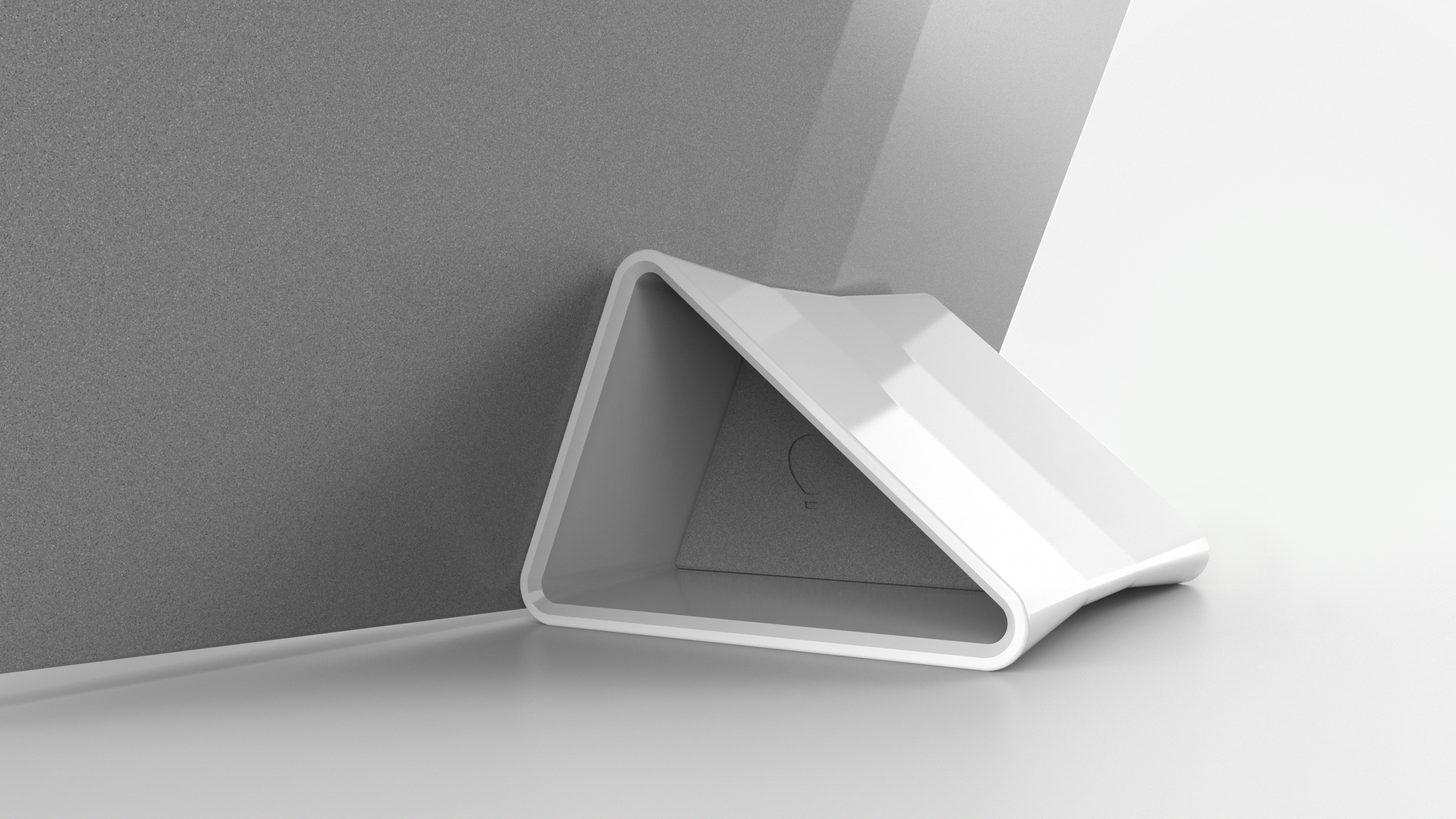
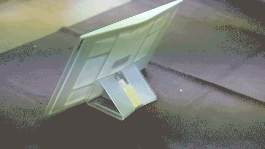
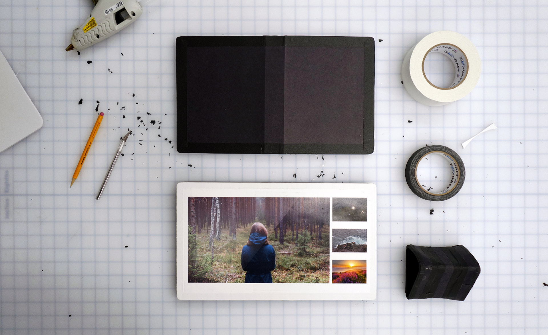
The hardware was designed to be held and shared similar to the classic photo album, or when docked, serve as a digital photo frame.

The brands design language intended to express lively, domestic emotions, and to ensure all interaction points were extremely informative.
At the time, Joy's founder was fond of the air balloon and felt the icon captured the brand's spirit. We adapted and ran with this story.


Joys backside was graphic and drew literal inspiration to that of a book. This design gesture separated itself in a saturated market of everyday tablets, and securely rested in the hand, making it easier to hold.
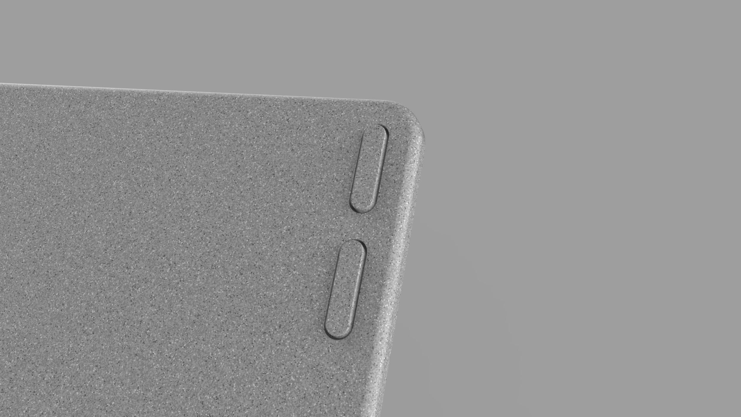
The speckled paint texture was an evolution to paint treatments seen on traditional DSLR cameras... But altered to complement home interiors.
*Note* this finish was implemented before the “speckled” trend started, I promise :).